Interactive and Animated Content
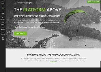
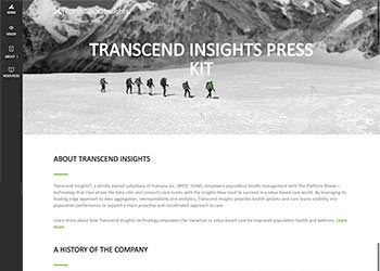
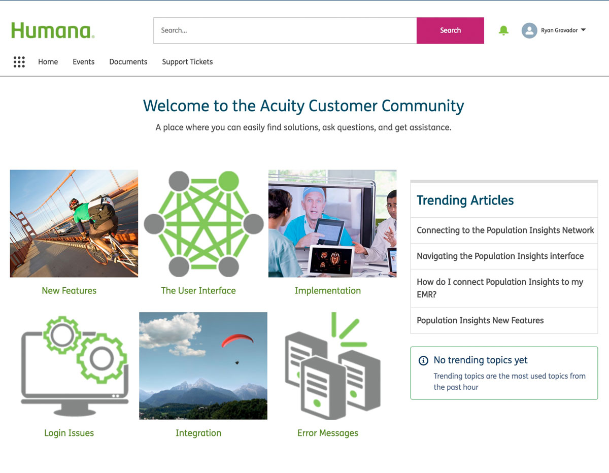
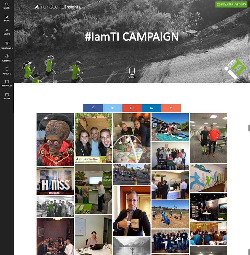
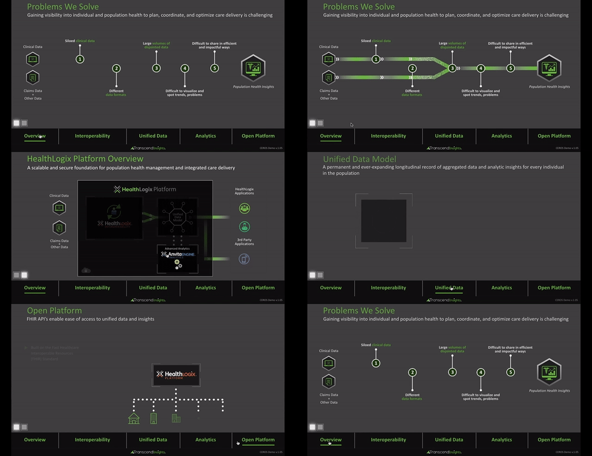
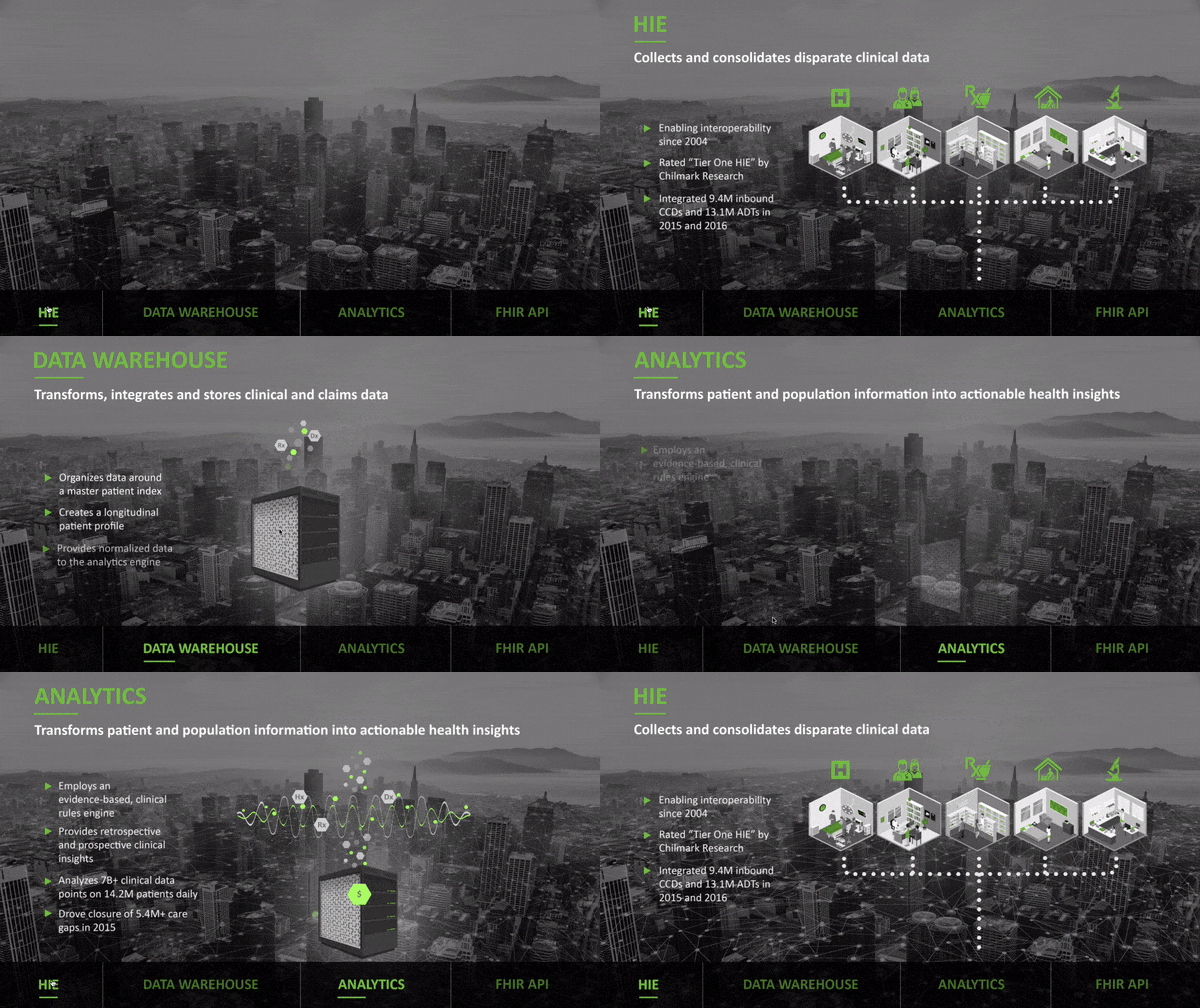
Examples of CEROS projects are shown here. They’ve been used on our infosite as pages and posts, and for presentation during events (either for HIMSS or lunch-and-learns at Humana locations.) Jump to project details.
Projects List
Click below to access the various projects, screenshots, and details.
Interactive Presentations using CEROS
PROJECT FOCUS
Unlike PowerPoint, CEROS creates animated experiences using: graphics, interactive and attention grabbing visuals, and mini-websites. It’s used for banners, adverts, presentations, etc.
ROLE, RESPONSIBILITIES & DUTIES
- Requesting and receiving timely support from the CEROS support team about: technical fixes, system options, and graphic suggestions.
- Brand consistency collaboration with Drew Miller and graphic designers, and Public Relations Lead for website body content.
- Team up with Senior Innovation Portfolio Strategy associates to communicate the technical aspects of the product in a presentation manner.
- Rounds of changes based on team stakeholders including Derek Takegami (manager) to clarify the presentation.
- Testing with multiple browsers for presentation purposes on multiple laptops and tablets.
- Creating internal server capabilities on PC’s and Mac’s for presenters using MAMP (as a backup option when the Internet is unavailable.)
- A revised “Platform” presentation has been put together that includes updated product branding, and new storytelling. Ryan worked with Jake Petralia (Senior Innovation Portfolio Strategy) and Derek Takegami (Marketing Campaign Manager Lead?) to further communicate and clarify the product for Humana clients.
*NOTE: Live links available as of April 2019. Pending further usage of the site remains at Transcend Insights (Humana) discretion.
CEROS Uses on the Infosite
PROJECT DETAILS
Vision Page:
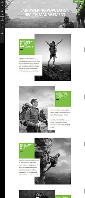
We hired the CEROS design team to create the initial layout for both desktop and mobile versions. Ryan was needed to adjust body copy for both and test for UX usability.
Blog Post:
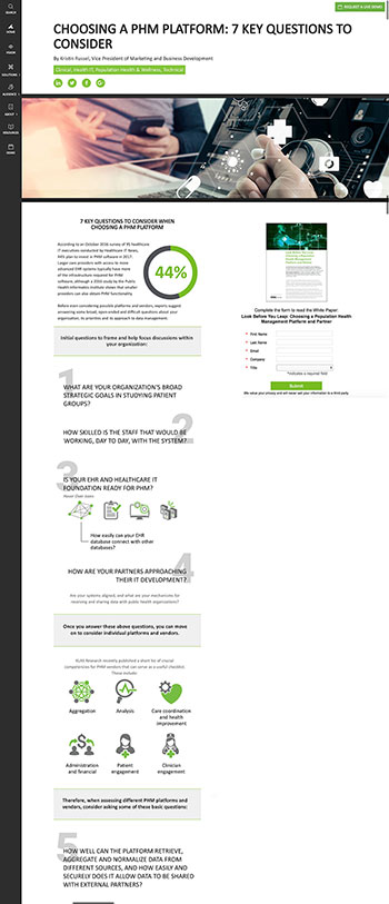
Upon CEROS usage and UX/UI testing, we decided to create interactive and animated body copy on a blog post. Both desktop and mobile versions were created by Ryan. Additionaly, the post needed to accommodate a lead generation form (PARDOT) as part of the page layout. Ryan was also responsible for creating UI graphic design icons and elements used in this project.
Thumbnail shows screenshot with the lead gen. form.
Infographic:
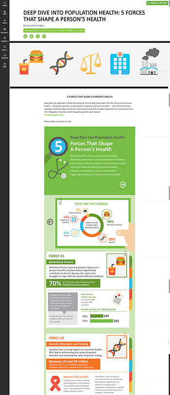
Our graphic designer, Drew Miller, put this together in the CEROS dashboard based on a static infographic. Ryan embedded the project onto a WordPress blog post.
Click on the thumbnail for screenshot.

