Staging Site and Theme Design
To test new design layout and concepts, research and correct errors, and fulfill requests made from the team. Jump to project details.
Projects List
Click below to access the various projects, screenshots, and details.
WordPress Website: Company Staging Site
PROJECT FOCUS
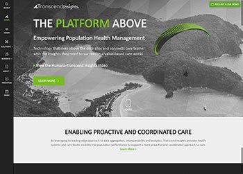
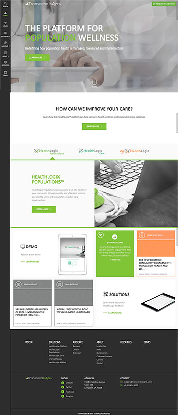
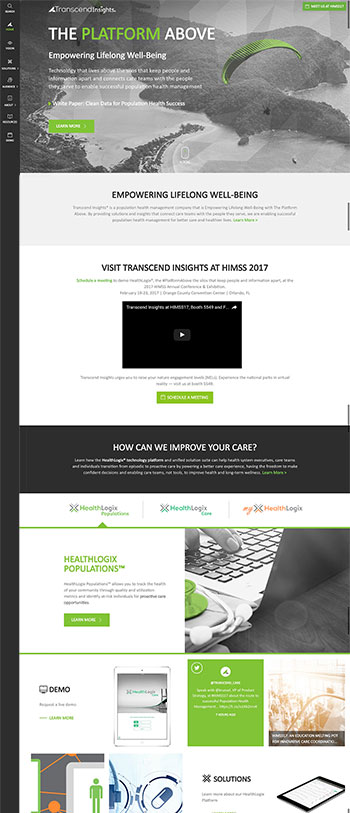
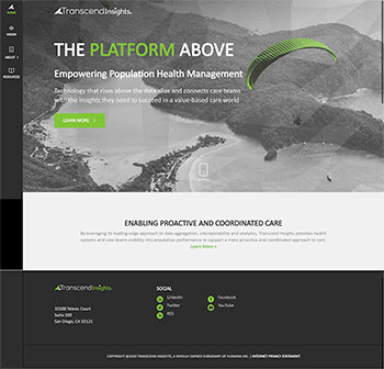
Homepage progression from 2016 into 2017, additions made to the WordPress theme for new body content, imagery, and video.
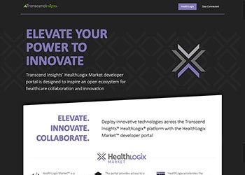
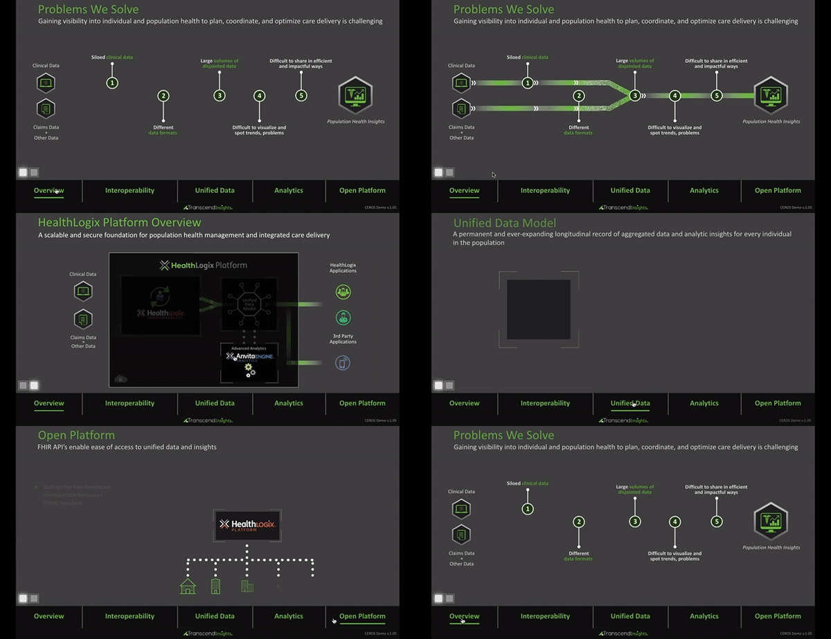
This is Transcend Insights staging site (internal viewing only), for the team to approve new content and newly designed layout pages. It allows Ryan to collaborate with Drew Miller, graphic designer, to adhere to brand guidelines, and uses this site to test new WordPress plugins, custom posts/pages, and layout design. We’ll test UX and new UI elements, lead generation forms, CEROS animated graphics, and overall functionality. Collaborative efforts included:
- IT/Server Engineers: Initial impact included working with IT Server Administrators and Jim Gough, Senior Data Architect, to implement regular backups of website databases and web files.
- In-house graphic designers, Drew Miller and Aldo Jacobo
- PR and digital marketing communications
- Screenshot samples
ROLE, RESPONSIBILITIES & DUTIES
- Testing newly designed page layouts: UX, typography, CSS, external links, photography and UI elements (in collaboration with graphic designers.)
- New requests for updated Career listings for approval, which is then pushed live.
- Updating body content for approval prior to implementing on the live production (infosite) site.
- UX and WordPress testing for mobile, plugins, and use of external embed codes: YouTube videos, CEROS animation, PARDOT lead generation forms.
- Site serves as a backup system in the case we need to refer to previous content that was pushed live.
Company Staging Site Screenshots
Click on the images to zoom in on the details and view from new tab.
PROJECT DETAILS
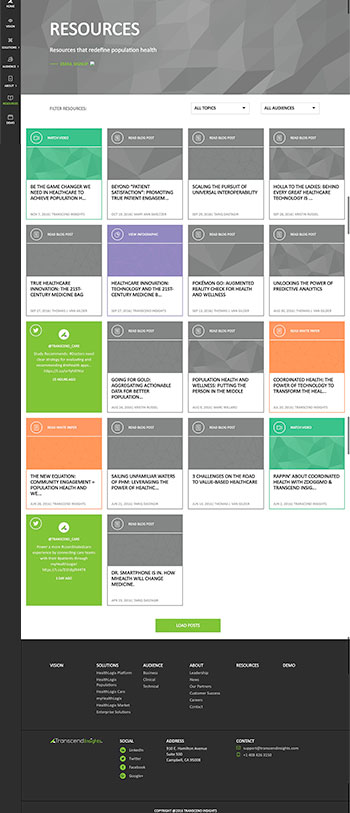
Before (2016-17) Resources Page:
View Screenshot
Ryan collaborated with GOLIN (original web design agency) and Transcend Insights stakeholders to modify the initial Resources page layout. UI elements and modified templates were introduced.
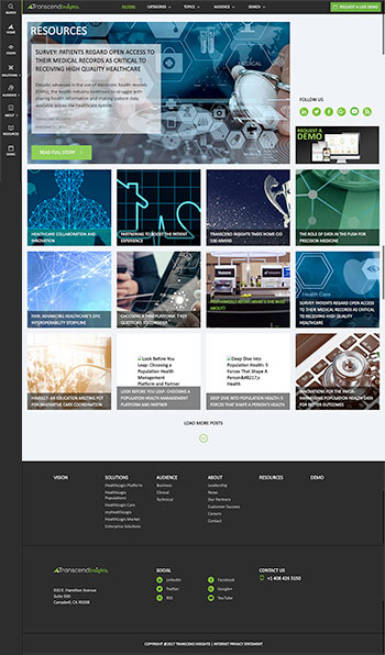
After (2017) Resources Page Modifications:
View Screenshot
UX and SEO was taken into consideration showing more imagery, a new featured post section, and a filtering solution at the top of the page. This was also done on the News page and readjusted blog post page layout.
PROJECT DETAILS
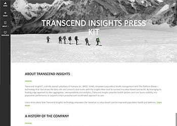
2018 Privacy and Press Kit Pages:
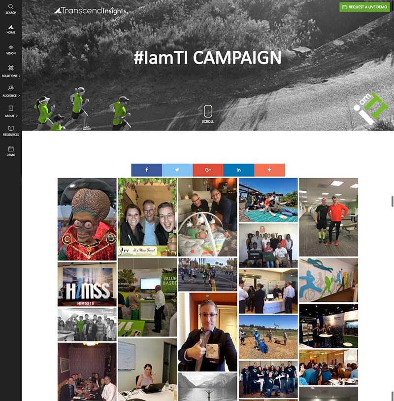
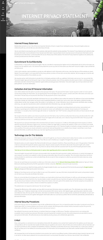
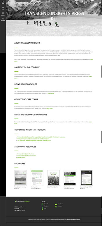
Full width page templates had not been provided as part of the custom theme. Ryan developed new page templates to fulfill PR requests for new body content.
2018 Homepage:
Previous Design (prior to 2019 merger.)
Recent changes as of January 2019 are now live. This staging site was used to test UX usability, approve of modifications and to see mockups, and to apply new UI elements.

